Turquoise Group
BRAND DEVELOPMENT + COLLATERAL + DIGITAL
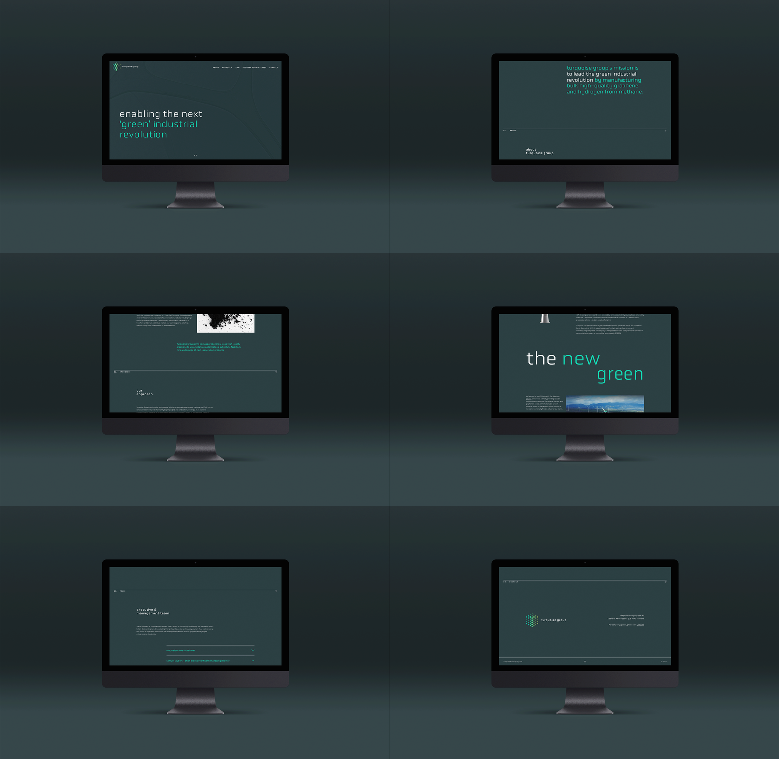
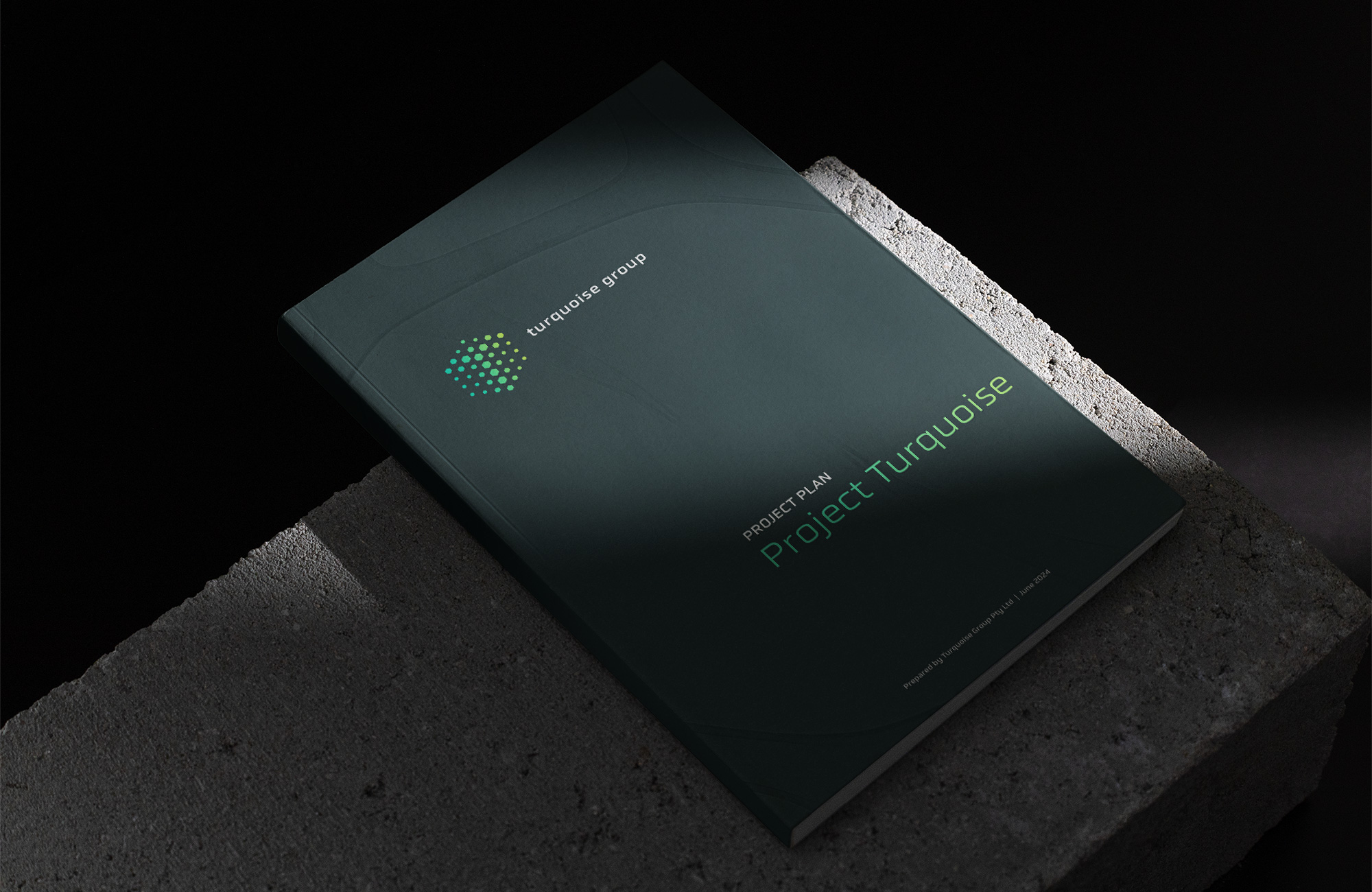
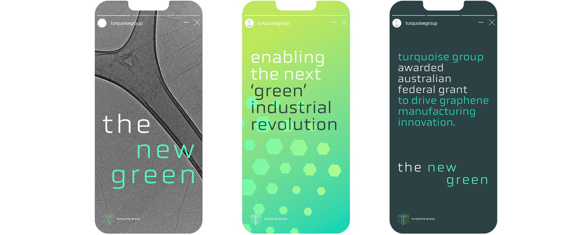
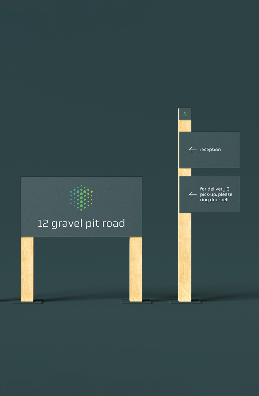
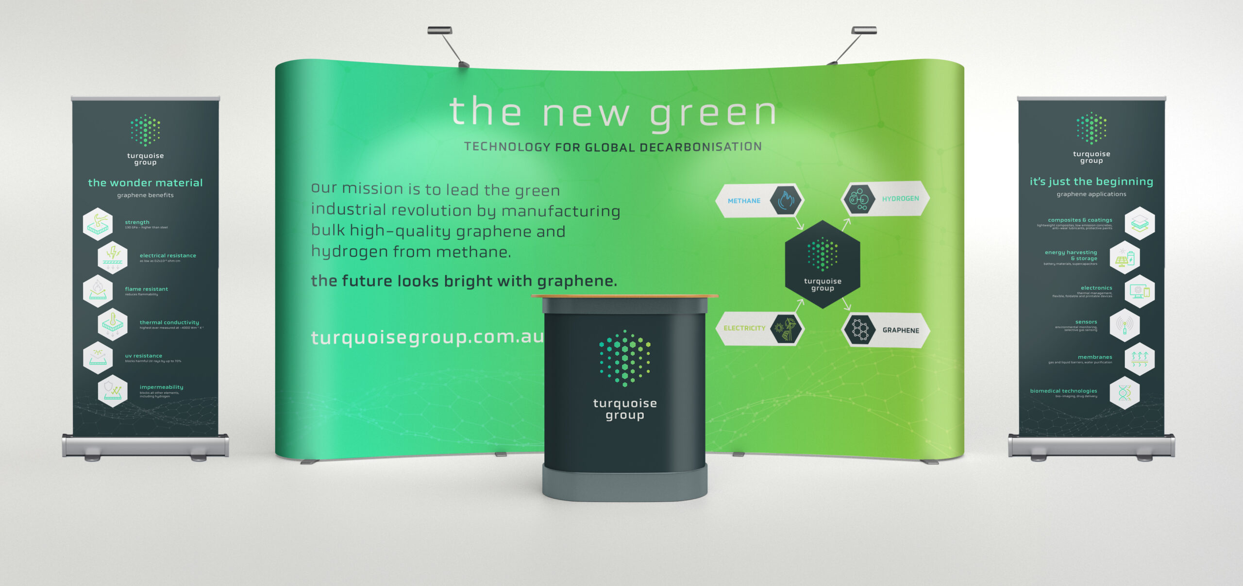
We approached Turquoise Group's brand with a clear focus on aligning the visual identity with the company’s forward thinking vision for sustainability, and technical expertise as leaders in graphene manufacturing.
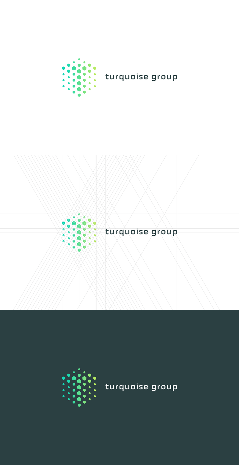
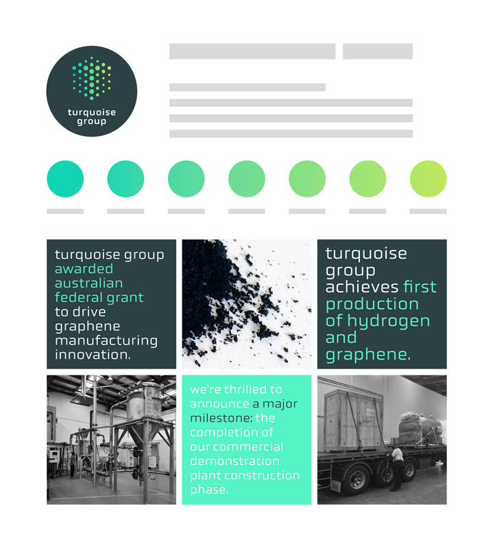
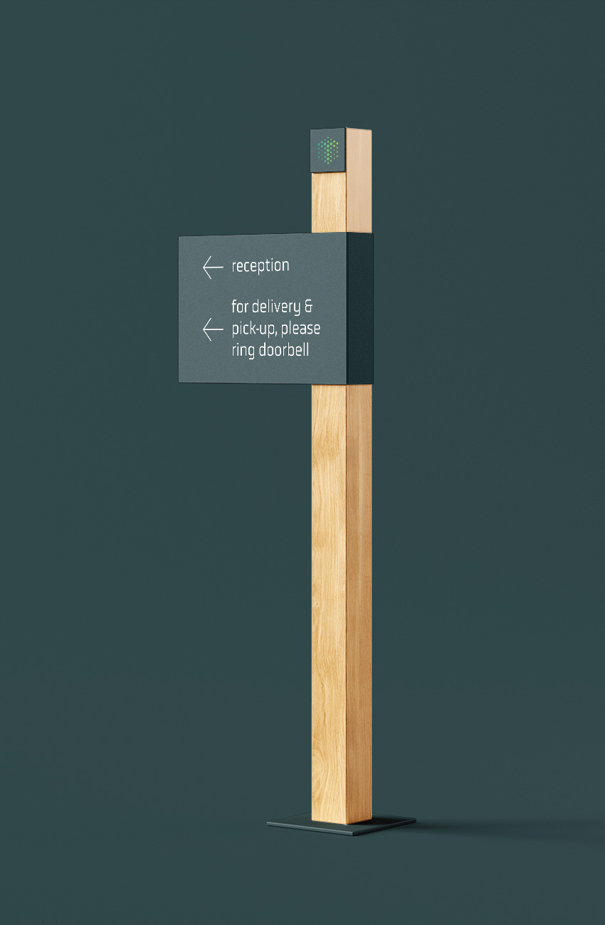
The logo centres around a hexagonal brandmark that subtly forms a "T" at its core. The hexagons symbolise graphene’s molecular structure, highlighting the company’s strength, adaptability, and innovative edge.
A turquoise-to-green gradient aligns with their values: turquoise represents technology and vision, while green reflects sustainability. Anchored by a graphene grey, this color combination creates contrast for visibility and impact. Custom typography echoes the hexagonal shapes, giving the logo a cohesive, memorable identity that communicates innovation and commitment to excellence in graphene solutions.
kind words
"ALTR Design turned a complex technology business into a compelling brand with global credibility. Their work elevated our entire commercial strategy – from investor conversations to product positioning. Exceptional creativity, clarity and execution."
– CEO & Managing Director
Turquoise Group

