Redflow
BRAND STRATEGY + DEVELOPMENT
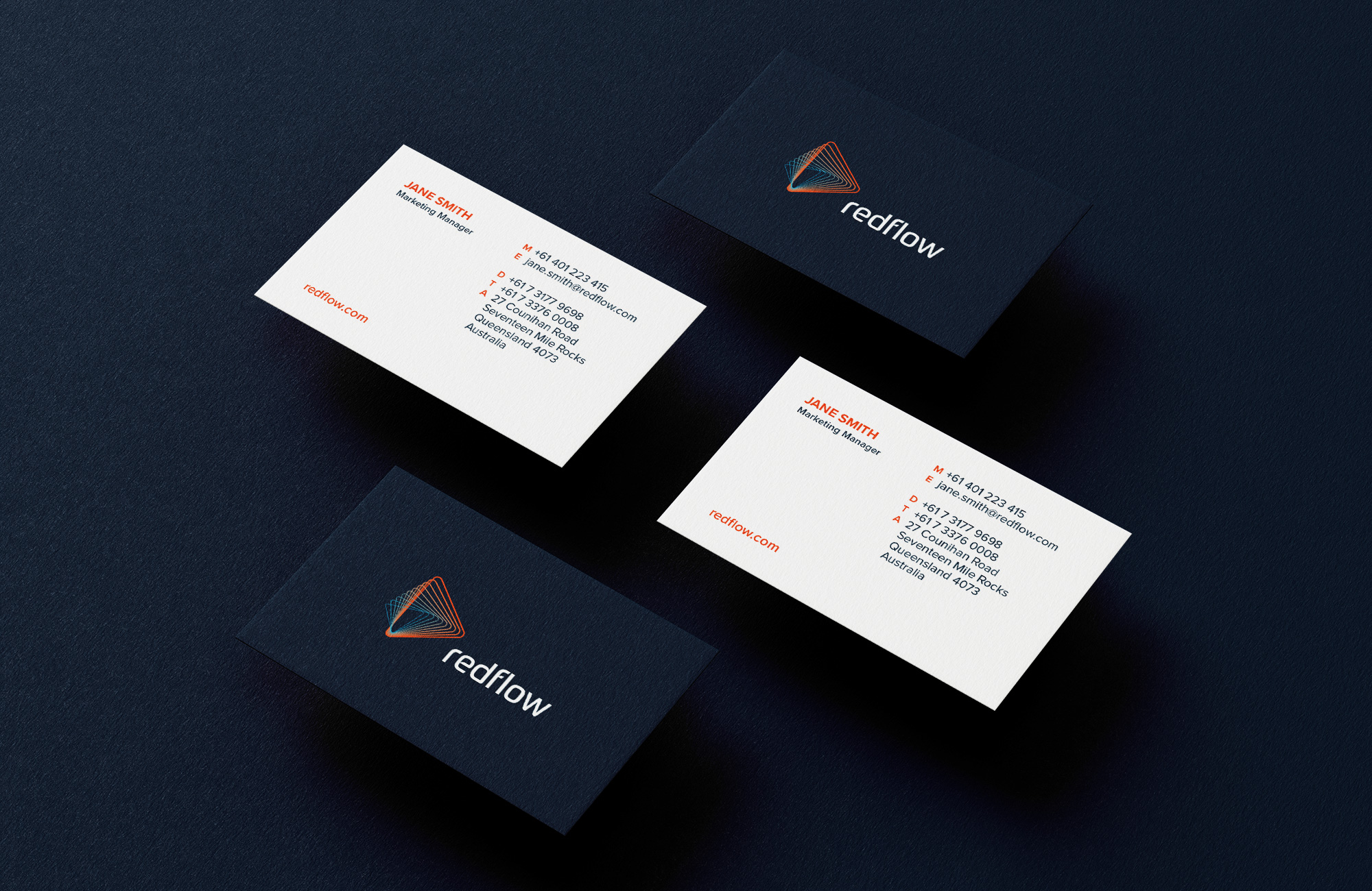
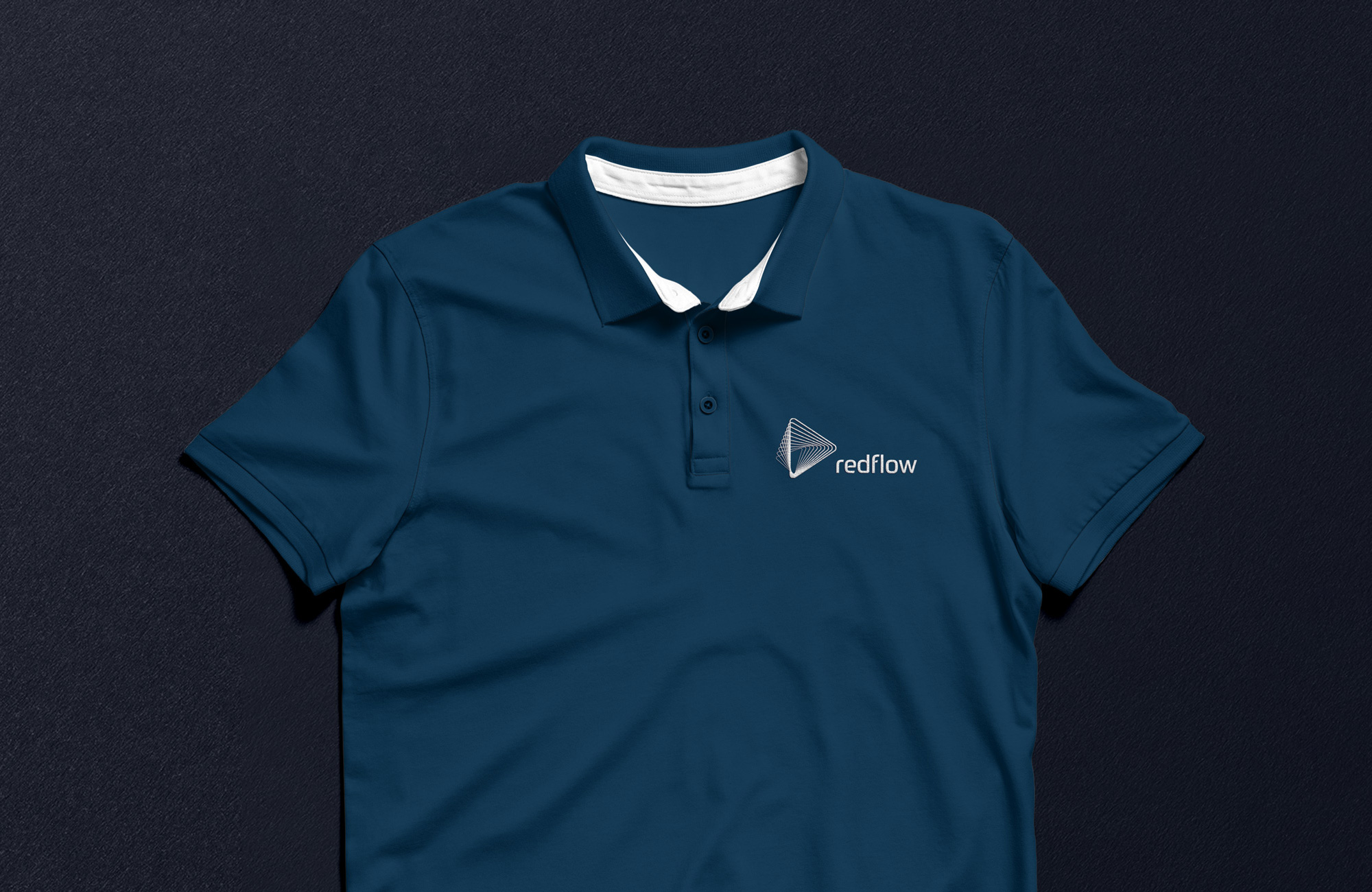
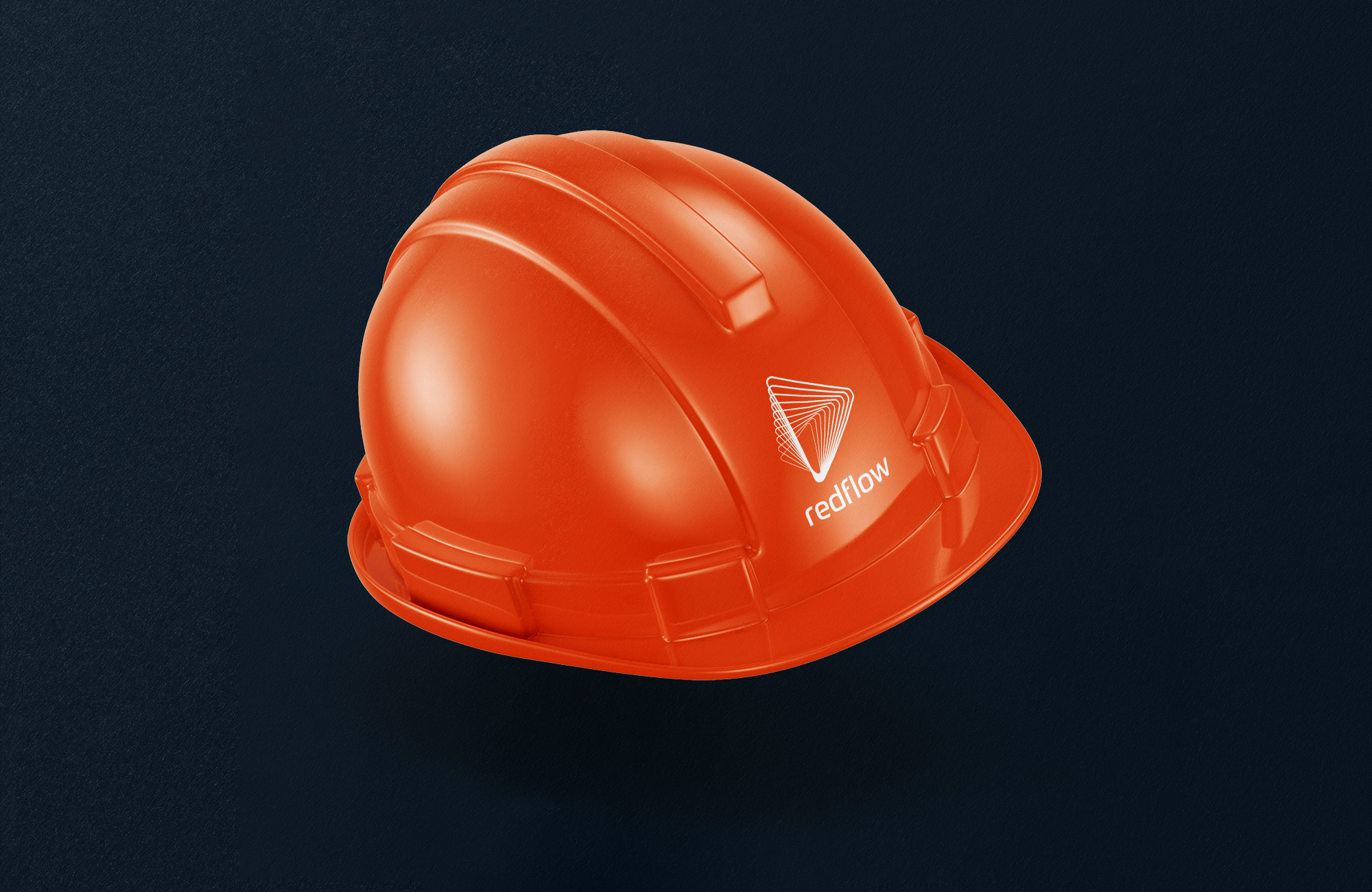
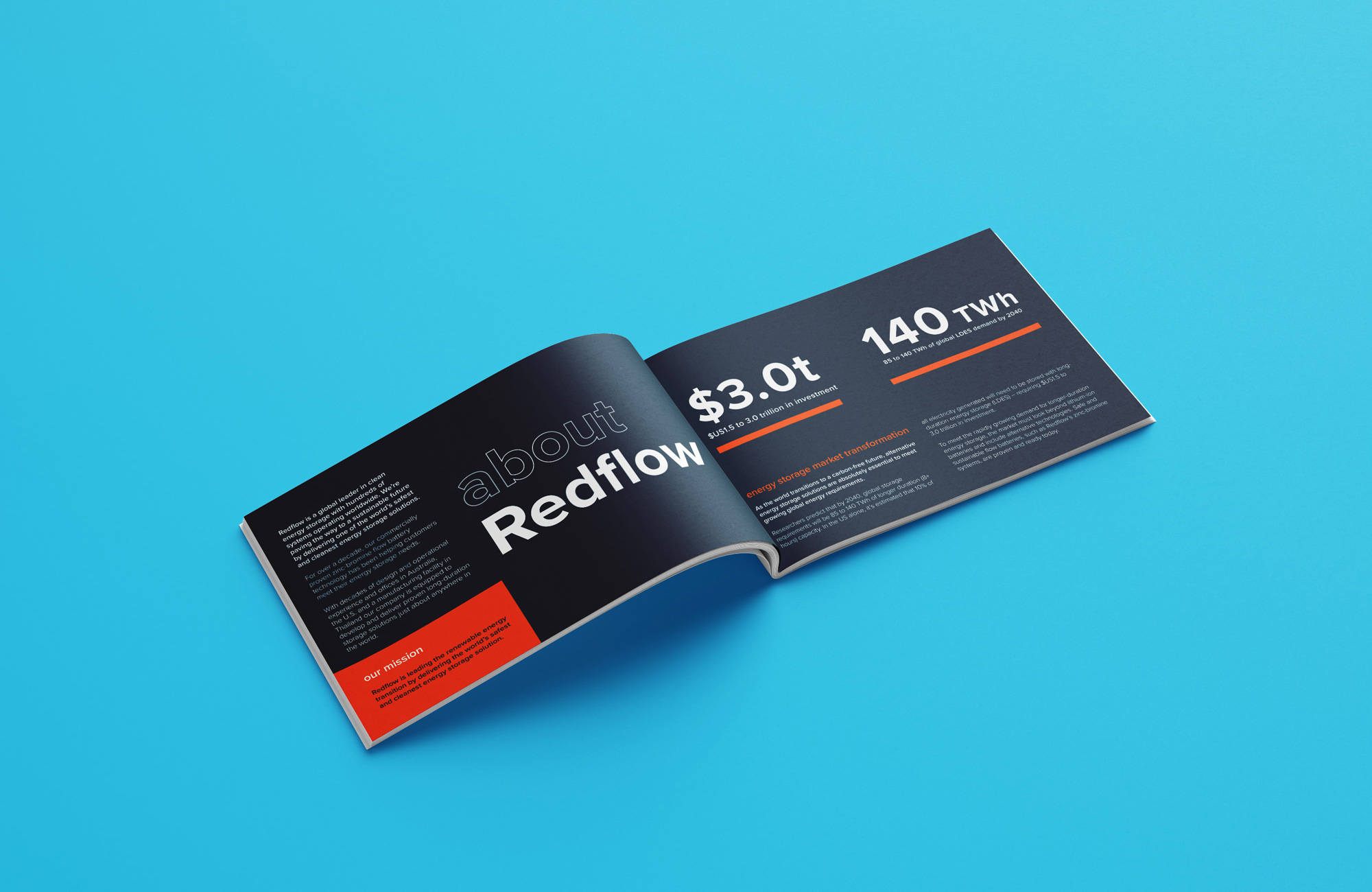
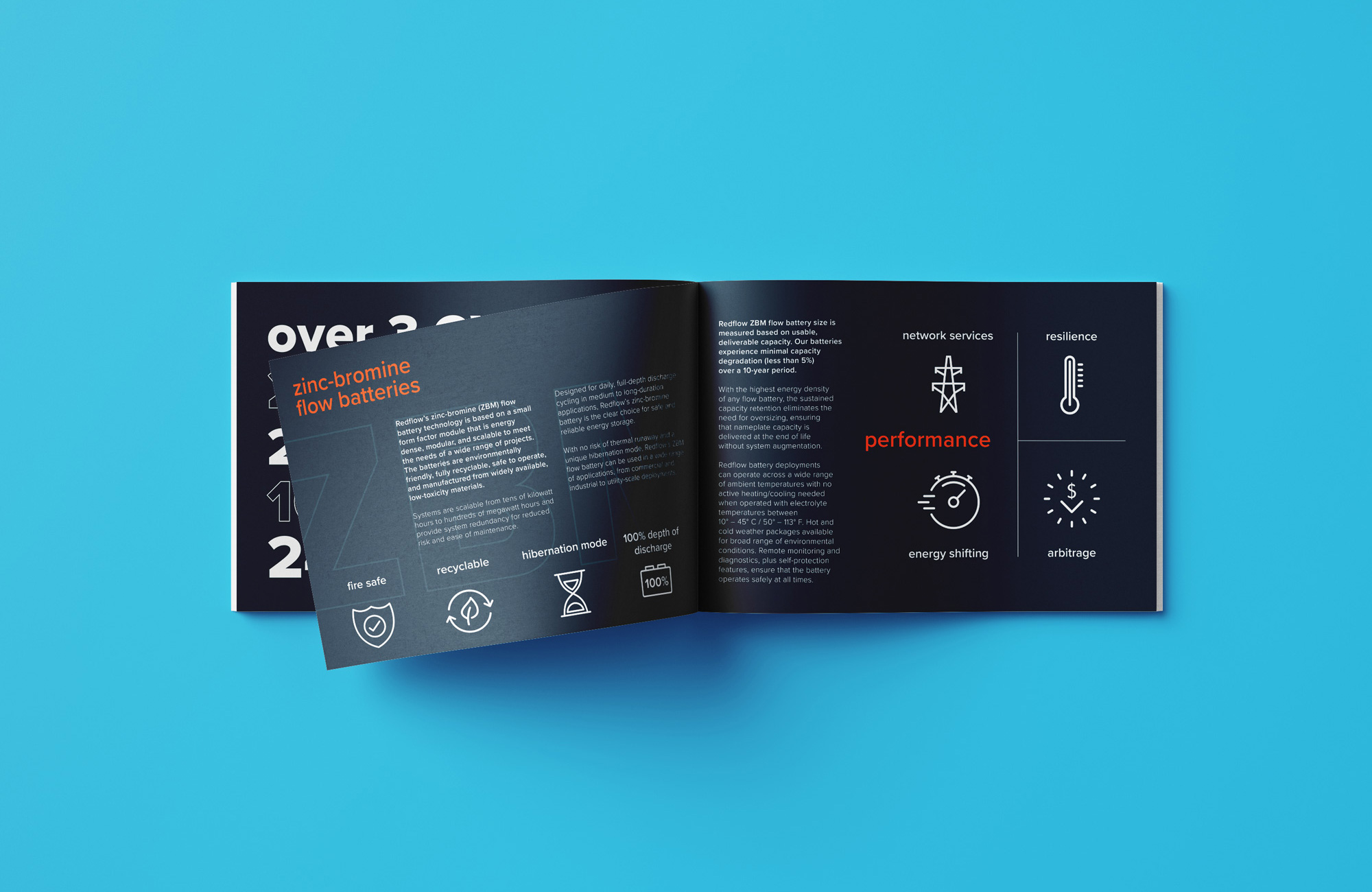
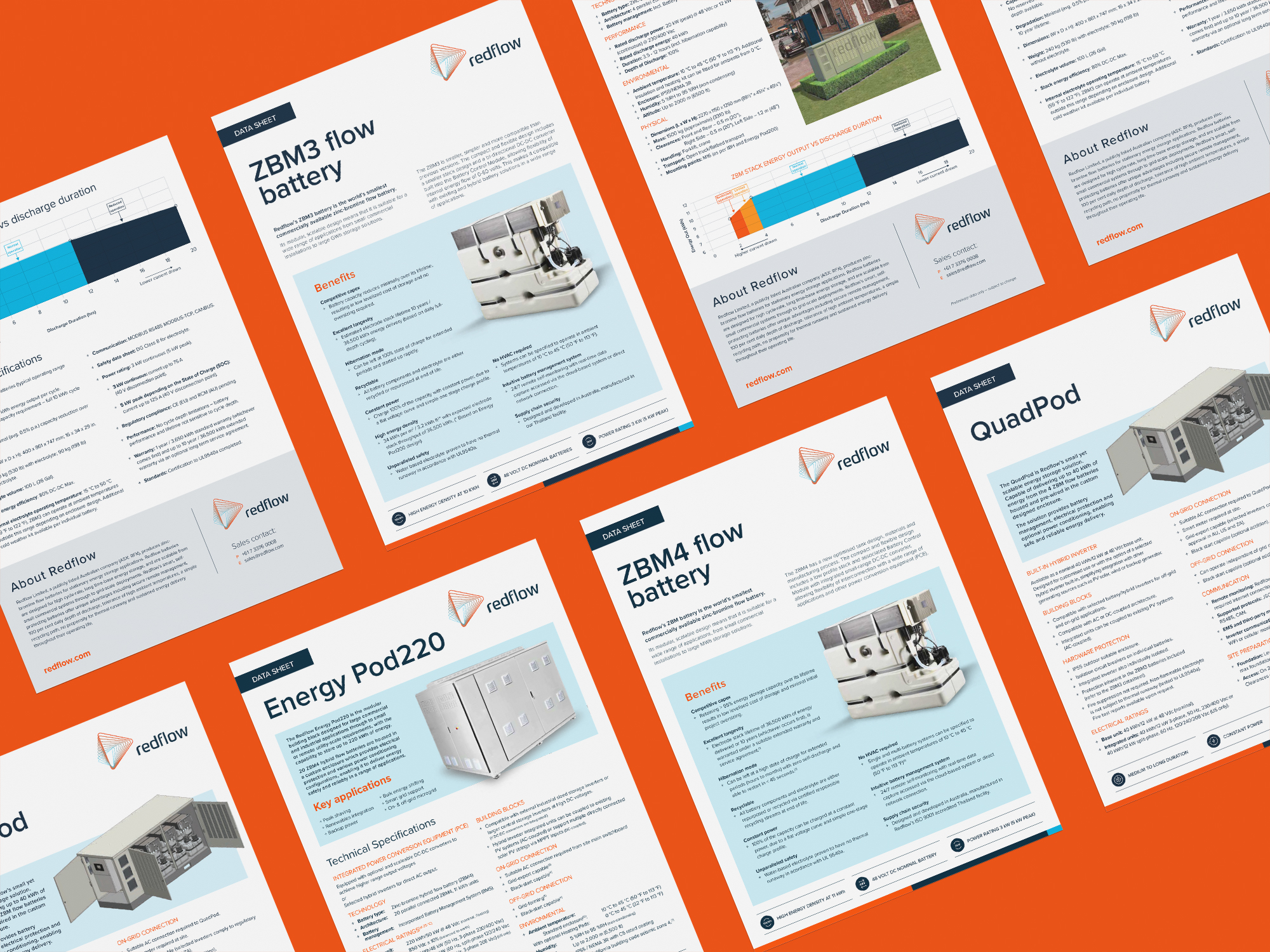
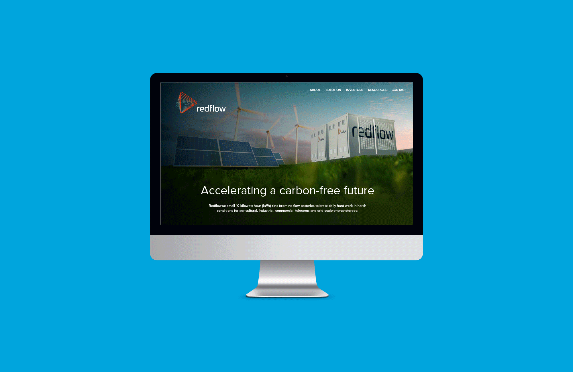
The Redflow rebrand is driven by a direct and distinctive visual element that reflects momentum and evolution. The identity incorporates geometric shapes, repetition, and movement to create a visual element that can be applied across the brand ecosystem as a constantly evolving, yet always connected, pattern. The arrow symbolizes a dynamic and ambitious company, highlighting Redflow’s determination and forward-thinking approach.
We’ve designed a custom font that, with its form, enforces a clear, contemporary, best-in-class and authentic brand. A confident palette of flame red, navy, and sky blue creates depth and velocity across the brand to clearly communicate a point of difference.
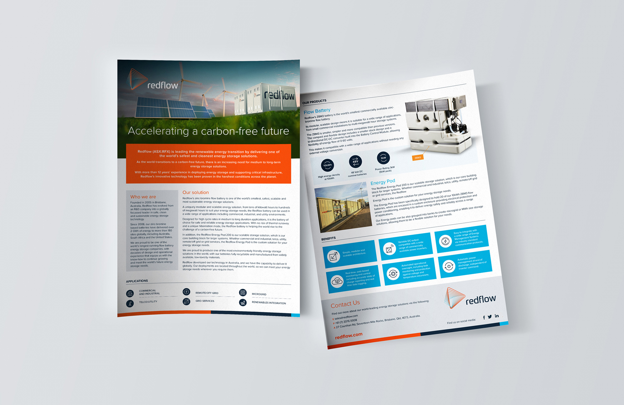
Every part of the brand's visual and verbal language has been painstakingly redesigned with emphasis on accelerating a carbon-free future as the core principle.