Manorina Farm
BRAND DEVELOPMENT
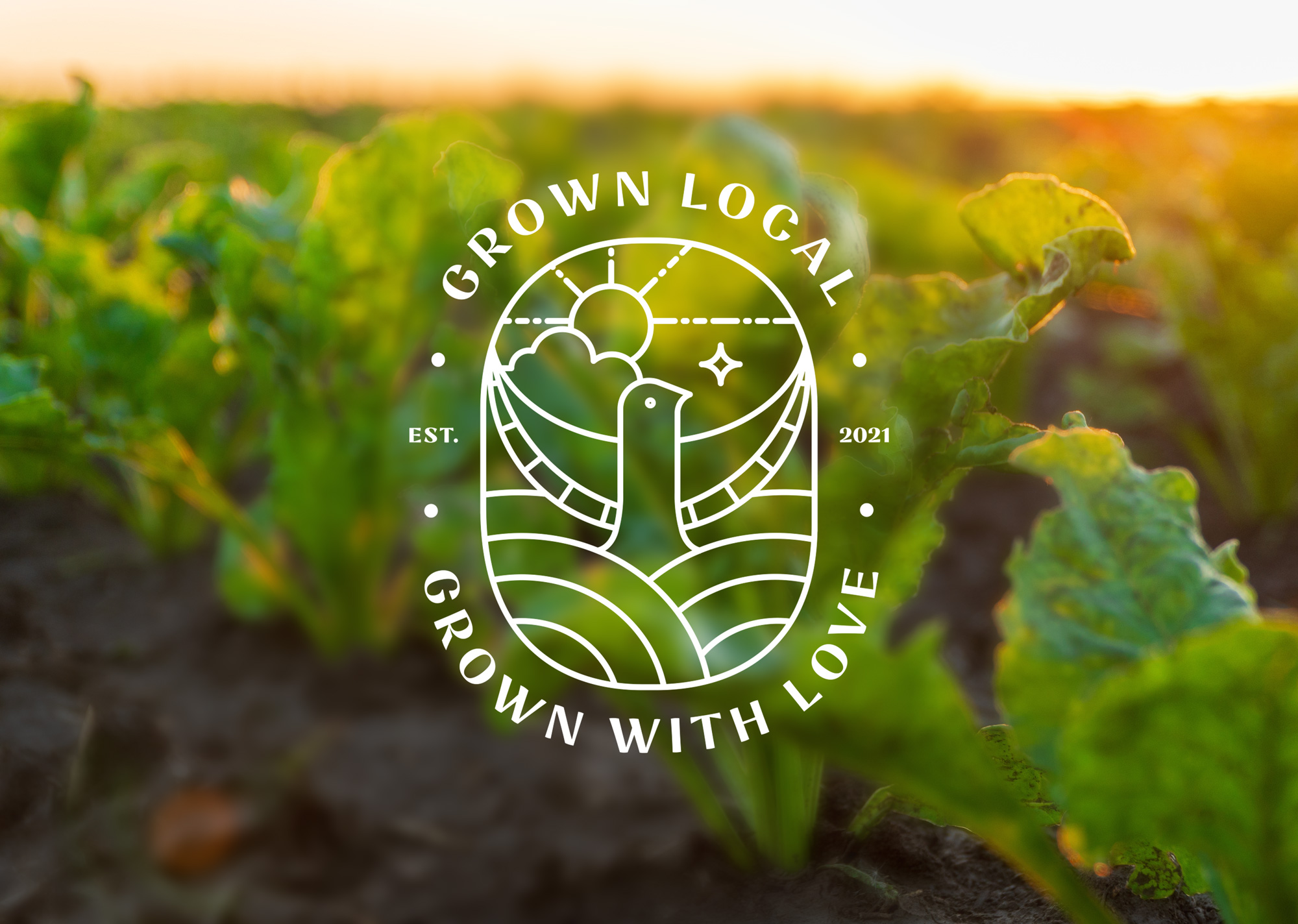
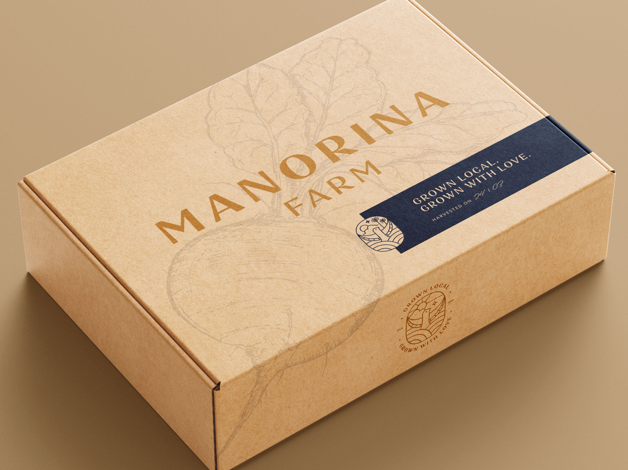
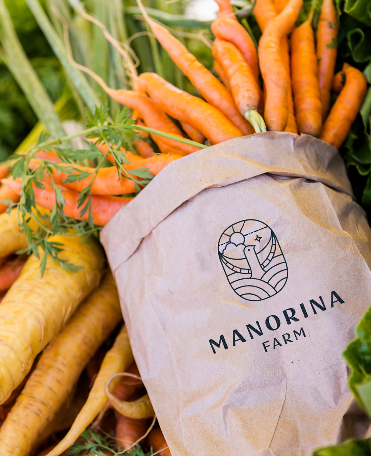
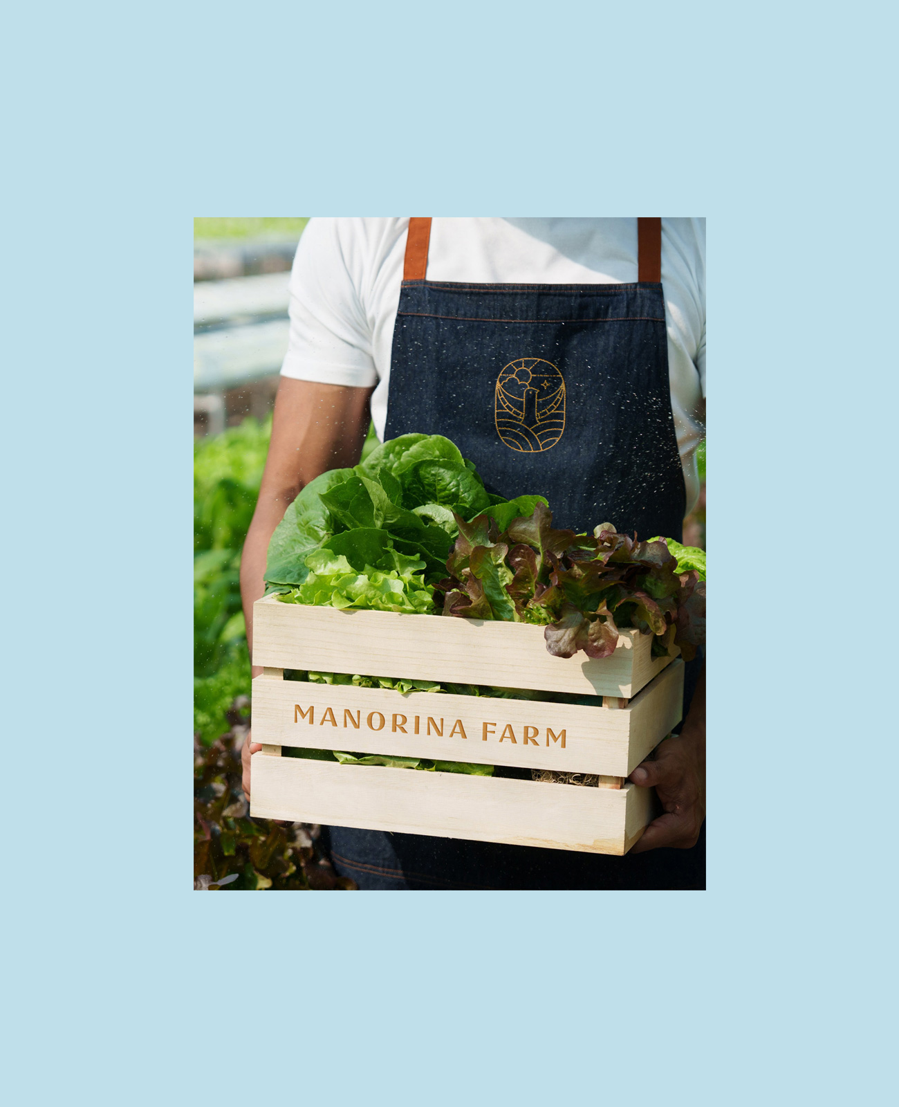
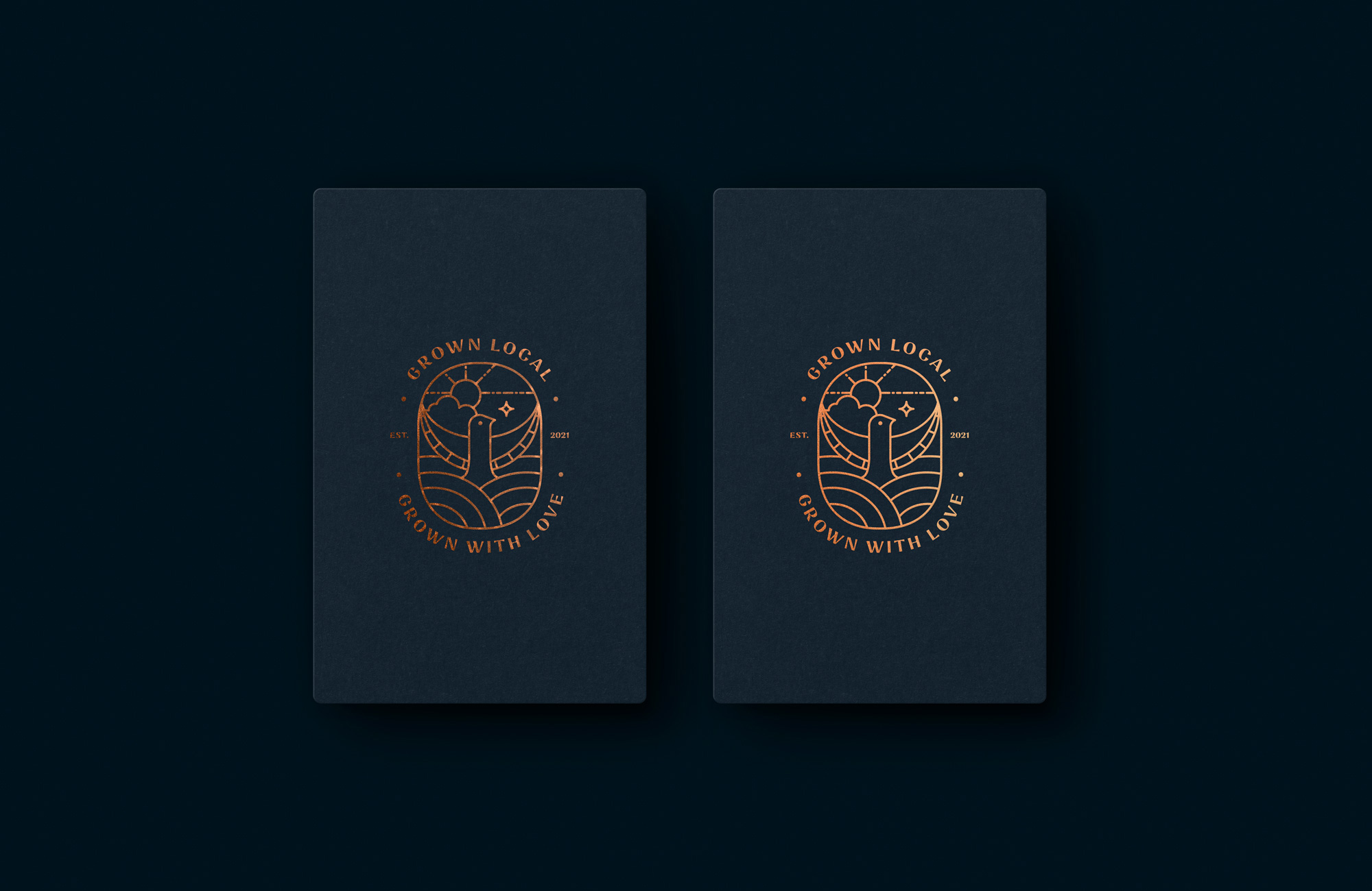
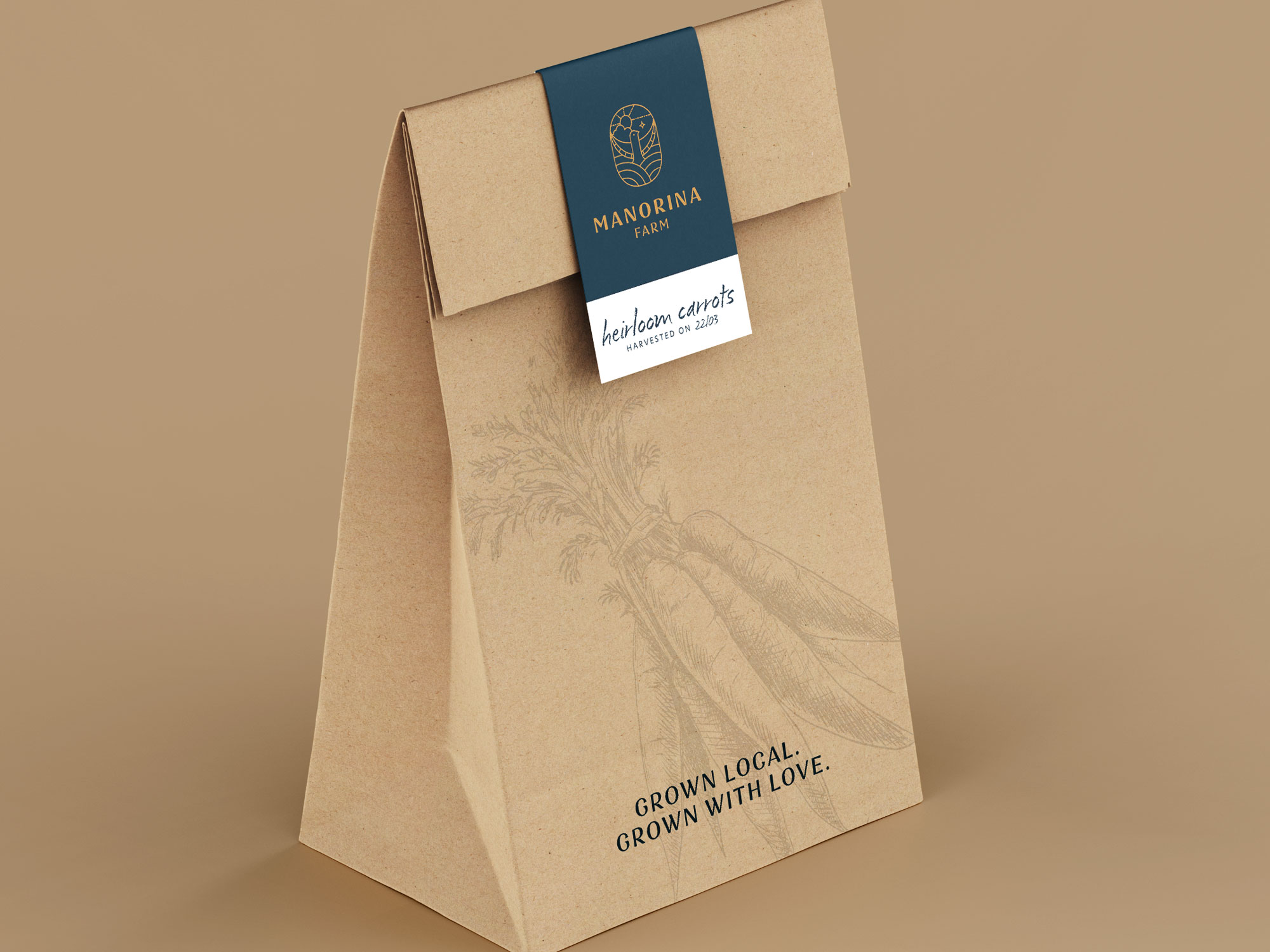
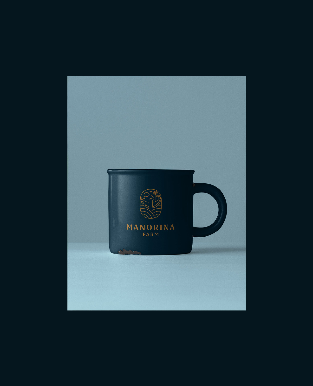
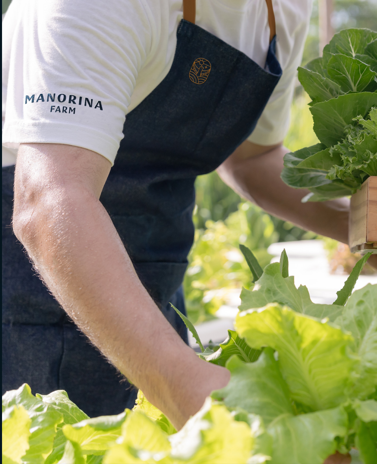
This brand identity draws inspiration from the symbolism of renewal and transformation, reflecting our client's shift toward a new chapter and a more grounded, purposeful way of life. The logo integrates the farm’s distinctive hillside topography and its striking view of two mountains, paired with the silhouette of the native Manorina bird from which the farm takes its name.
The resulting brandmark is distinctive, memorable and deeply connected to place – capturing both the spirit of the landscape and the sense of rejuvenation at the heart of the farm’s story.